
Why “more feedback” is the wrong goal
Most product teams don’t suffer from a lack of feedback. They suffer from uneven feedback: a few loud channels and a few vocal segments dominate what gets discussed, logged, and prioritized. The result is a roadmap that reflects who is easiest to hear, not who is most important to serve.
A Feedback Source Coverage Map is a lightweight method for measuring which customer segments you’re not hearing from—using the feedback you already capture from support, sales, and product channels—so you can fix blind spots without launching more surveys.
What a Feedback Source Coverage Map is
A Feedback Source Coverage Map is a matrix that compares:
- Customer segments (who the feedback should represent)
- Feedback sources (where feedback currently comes from)
Its purpose is not to count every request. It’s to reveal coverage gaps—places where a segment matters to the business, but the team rarely receives usable input from that segment through any source.
Segments to include (typical examples)
- Plan tier (Free, Pro, Enterprise)
- Revenue band or ACV
- Industry (e.g., healthcare, fintech, agencies)
- Company size
- Use case or job-to-be-done
- Lifecycle stage (trial, onboarding, expansion, churn risk)
Keep it simple: 5–10 segments is usually enough to uncover patterns. Over-segmentation makes the map hard to interpret and harder to act on.
Sources to include (typical examples)
- Public feedback portal requests
- In-app feedback and micro-prompts
- Support tickets (Zendesk/Freshdesk/Intercom)
- Sales notes and call transcripts (CRM, Gong, Zoom)
- Account management / success notes
- Social/community and app reviews (if relevant)
Use the sources you already run. The “without more surveys” benefit comes from treating existing operational systems as a continuously-updated feedback stream.
How to build the map in under an hour
You can build a first version in a spreadsheet and refine later.
Step 1: Choose the segment axis you’ll actually prioritize by
Pick segments you routinely use in planning (revenue tier, industry, or lifecycle). If leadership decisions revolve around revenue impact, a revenue-tier segmentation is usually the fastest to operationalize.
Step 2: List your feedback sources and define what “usable feedback” means
To avoid noisy counts, define a minimum bar. For example: a request counts only if it includes a clear outcome, a user context, or a reproducible scenario. The goal is consistency, not perfection.
Step 3: Add two simple measures per cell
- Volume: How many usable items did we capture from this segment via this source over a time window (e.g., last 30–90 days)?
- Quality: A quick score (e.g., 1–3) based on clarity and actionability.
Even rough scoring works as long as it’s applied consistently across sources.
Step 4: Normalize by segment size or value
A segment with 20 customers shouldn’t be expected to generate the same raw volume as a segment with 2,000. Normalize using something you already trust:
- Number of active accounts in the segment
- Revenue/ARR in the segment
- Seat count (if relevant)
This turns “we got 3 requests” into “we got 3 requests per 100 accounts” (or per $1M ARR), which is much more diagnostic.
Step 5: Flag coverage gaps, not just low numbers
A coverage gap is a segment that is important and underrepresented across most sources. That’s different from a segment that is quiet in one channel but well-covered elsewhere.
What coverage gaps usually mean in practice
Once the map is visible, patterns tend to repeat across companies.
1) The segment isn’t reaching your current sources
Enterprise users might avoid public portals; regulated industries might not share details in community threads; trial users might abandon before leaving feedback. If you only listen where you’re most convenient, you’ll miss where users are most constrained.
2) Your instrumentation favors certain behaviors
In-app prompts capture engaged users, not struggling ones. Support tickets represent pain, not desired outcomes. Sales calls overrepresent prospects and expansion accounts. A map makes these biases explicit so you can counterbalance them.
3) Your team is deduplicating away important nuance
When feedback is merged aggressively, segment context can disappear. Two customers may request the “same feature,” but for different workflows and urgency levels. The map helps you detect when “one big pile of feedback” is masking segment-specific needs.
How to fix gaps without running more surveys
The point of the map is action. Here are practical ways to improve coverage using existing workflows.
Improve capture where the segment already communicates
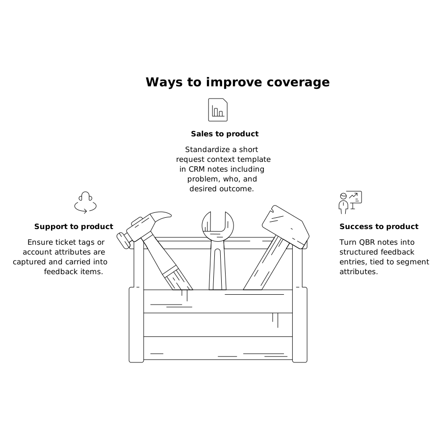
- Support to product loop: ensure ticket tags or account attributes are captured and carried into feedback items.
- Sales to product loop: standardize a short “request context” template in CRM notes (problem, who, desired outcome).
- Success to product loop: turn QBR notes into structured feedback entries, tied to segment attributes.
If you’re centralizing these streams, a platform like canny.io can help by consolidating feedback from common tools and keeping segment context attached, so the map isn’t maintained manually.
Add “pull” mechanisms instead of “ask” mechanisms
Surveys are an ask. Pull mechanisms collect feedback as a byproduct of existing actions:
- Turn common support macro categories into pre-filled feedback items for product review
- Capture feature requests from call transcripts and route them into a consistent taxonomy
- Add a short optional “what were you trying to do?” field where users already report an issue
The key is to reduce friction and avoid placing another feedback burden on users.
Close the loop per segment, not just per feature
Teams often announce updates broadly, then wonder why certain segments remain quiet. Segment-specific follow-ups (e.g., informing Enterprise admins when an admin workflow improves) increases future feedback quality because users learn that their input leads to outcomes. This also prevents over-investing in features that only the loudest segment requested.
Operationalizing the map for ongoing decisions
The map is most valuable when it becomes a lightweight review artifact:
- Monthly: refresh volumes, spot new gaps caused by growth or channel changes.
- Quarterly planning: sanity-check roadmap themes against coverage (are we reacting to one channel?).
- After launches: compare post-release feedback by segment; silence can mean “resolved” or “disengaged.”
To keep it manageable, focus on the top 2–3 gaps at a time and define a specific intervention per gap (capture improvement, routing fix, or targeted loop closure). If you’re also working on measurement infrastructure, it’s worth aligning this effort with a broader approach to tracking attribution and consistency—for example, avoiding duplicate landing page variants that fragment conversion and segment reporting (see landing page canonicalization fixes).
What “good coverage” looks like
You’re not aiming for equal feedback volume from every segment. You’re aiming for:
- At least one reliable source that consistently represents each important segment
- Segment context preserved through deduplication and prioritization
- A repeatable path from raw signals to roadmap decisions
When those conditions hold, the map stops being a diagnostic tool and becomes a guardrail: it prevents the team from mistaking “we hear this a lot” for “this matters most.”